 Louise Urquhart

Website design is a multi-layered process with so many different elements to consider. A website needs to be aesthetically pleasing enough to engage the User, while also representing the Company brand and delivering the information it needs to in a clear and concise way.
Simple, right?
So how do you ensure your potential Customers or Clients gravitate towards your website rather than passing it over for one of your Competitors?
There are a number of key elements which consciously or subconsciously affect a User’s first impression of your site.
And boy is that first impression important, with Users on average taking a mere 50 milliseconds to form an opinion of your site.
Here are a few ways in which you can begin to create a website that people want to engage with.
Pro Photos
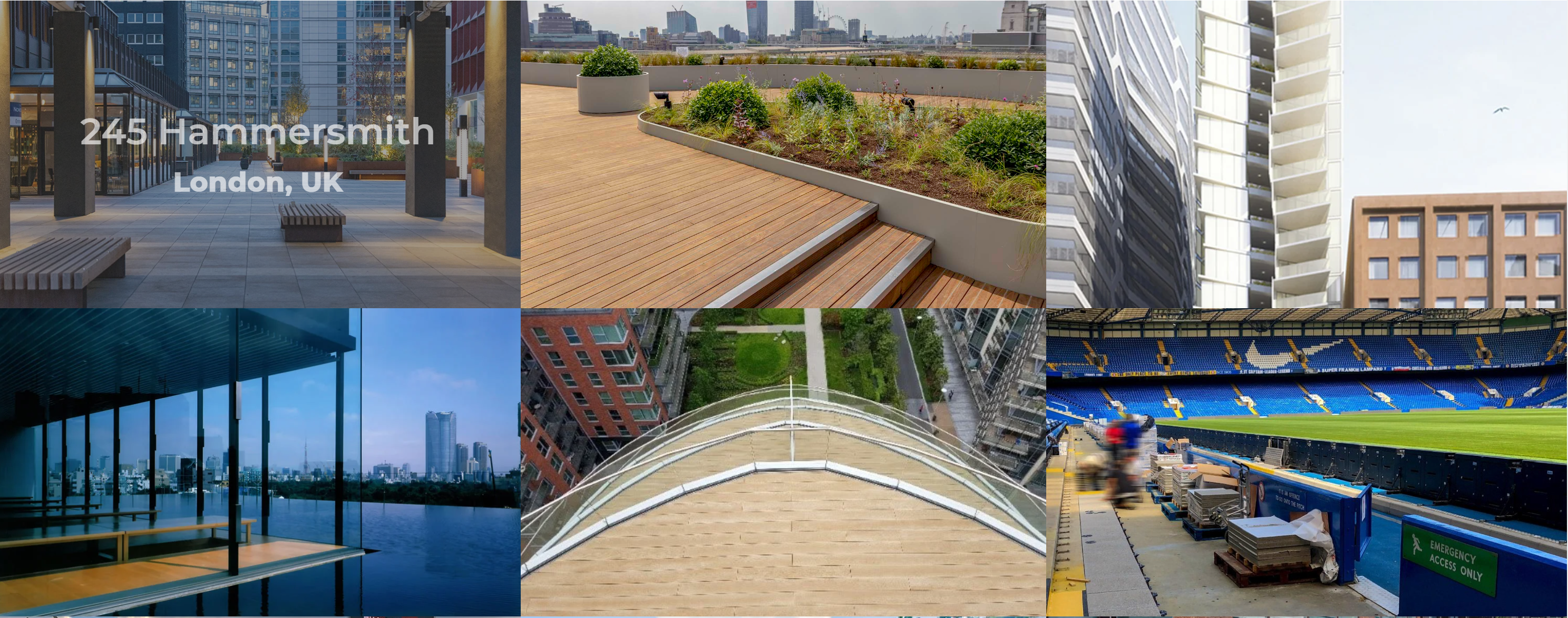
Image courtesy of Buzonuk.com. You can read our Buzon UK case study here.
According to SWEOR.com, 38% of people will stop engaging with a website if the content or layout is unattractive.
Bad photography is the no. 1 culprit for making a site look amateur and unprofessional. A website can be a major investment in itself but cutting corners with the photography or design elements can really devalue that investment and put prospective Customers off.
In contrast, amazing photography on your building product website can really grab your User’s attention. Using custom photography of your team, products or services, rather than hiding behind cheesy stock photography will help with building that all important element of trust with your website User.
An On-Brand Colour Palette
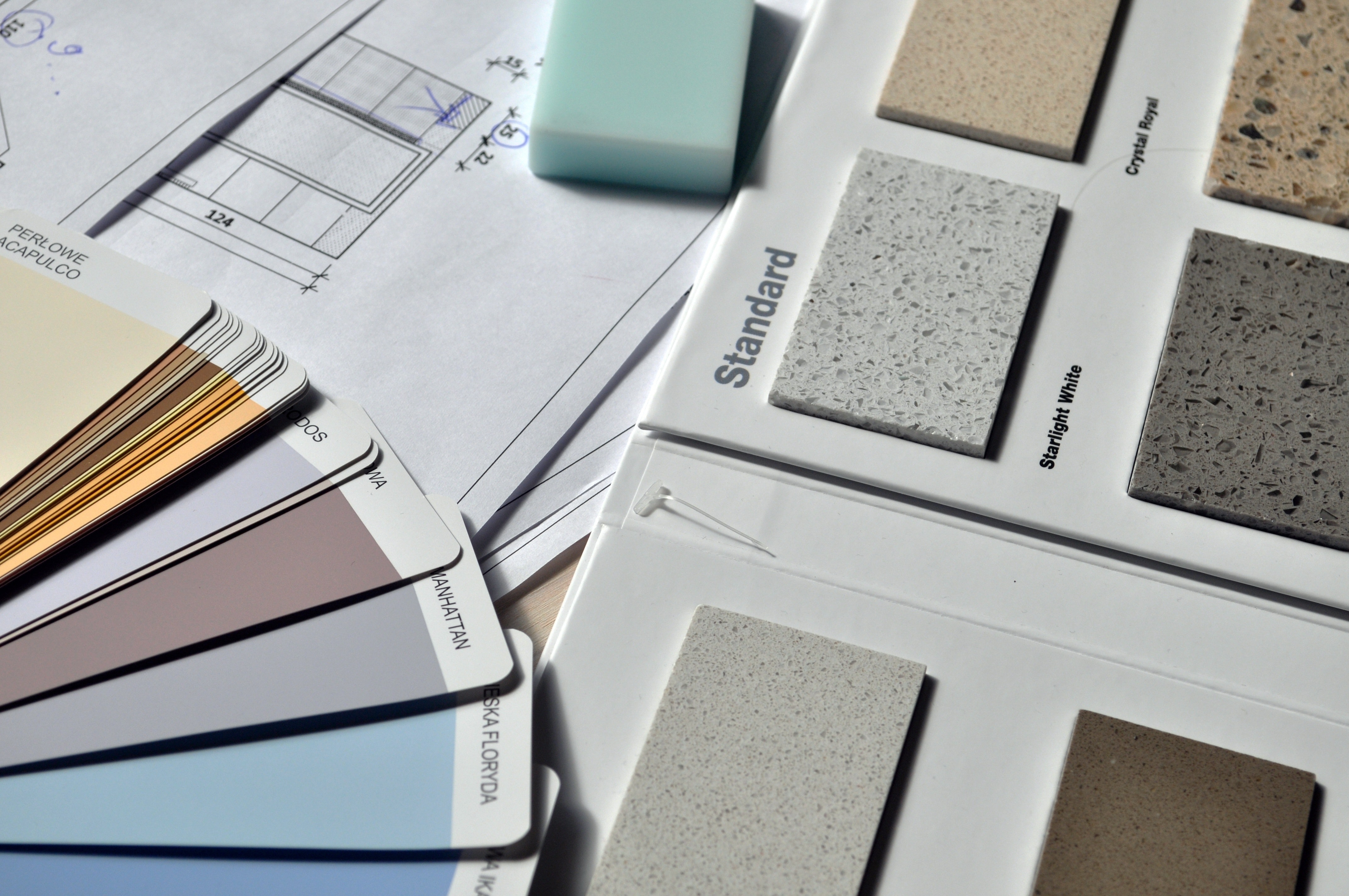
Your website should speak volumes about your Company both in terms of the content and also in terms of the visual elements.
Carefully considered colour is essential and you should use a colour palette which strengthens your visual Brand.
Chose a selection of key colours that you can use consistently throughout your site to make the overall appearance cohesive and identifiable as coming from your Company.
Make sure you include a contrasting colour in your palette to help make those all important CTAs pop.
Tremendous Typography

Clever use of typography can do so much for a website. It can convey the personality of your brand.
Serif fonts are more traditional and formal, sans serif gives an overall modern appearance and scripted fonts ooze personality.
Yet typography can also affect the readability of the website.
A large, solid block of decorative text will be difficult for the reader to process. However, choosing well-spaced, easy-to-read fonts, which are broken up into smaller more digestible blocks of text, will help guide the User around the webpage. You can use larger, heavier fonts for emphasis or to guide Users to the content they want.
And don’t go bezerk with multiple font choices all thrown together. As a general rule, 2 or 3 different fonts is about right.
Intuitive Website Navigation
Optimising your Building Product content for SEO is futile if your User can’t find their way to the content they need. Confusing navigation and website structure will lower engagement and inevitably conversion will be at rock bottom.
When considering a website design, Navigation should be at the forefront of the process. Carefully plan out what should be on each page to make life as easy for your Customer as possible, then use a sitemap to illustrate how the pages within the website will link together.
Once you have established a easy-to-follow website structure, then you need to plan how the navigation on the page will work. Designers use “wireframes” - basic line and block drawings which show which elements need to appear where on a page.
This tool is invaluable for planning out the ways in which your User can move around your site. The main navigation should be clear and easily visible and all pages should be accessible within 1 or 2 clicks.
Bigger sites might benefit from a mega menu, so that most product categories are reachable in one click. Plus, breadcrumb navigation can help make the flow between pages smoother.
Also make use of footer navigation, CTAs and internal linking further down your page, so that no matter where your User is, they can find their way to the info they need.
Accessibility
An important aspect of your site should be accessibility, in other words, addressing issues which could potentially rule out certain people from using your site.
Text clarity and readability can be a huge stumbling block for people with even minor visual impairments. Yet by making some minor adjustments, you can increase legibility for many people.
As a general rule, the minimum font size on screen should be 16px and there should be sufficient contrast between the colour of the text and the background it sits on. Allowing some white space between your lines of text (approx 25% height of the font), will aid with readability - as will breaking larger chunks of text into blocks of a few sentences.
Adding alt tags to images is essential too. The Alt tag or text is the piece of copy that will appear in place of an image if it doesn’t load properly for the User. Screen-reading tools can use the alt tags to describe the image to visually impaired site visitors and ultimately it also helps with SEO.
Colourblindness affects around 1 in 12 men globally and 1 in 200 women according to Colour Blindness Awareness. Use colours which are tonally very different rather than subtle colour variations.
In addition, consider adding icons to areas you want the User to engage with. For example, if someone is unable to view the red colour on a download button, adding a download icon on that button will help.
Responsive Design
Don’t forget to consider how your website will be viewed on mobile devices as well as on desktop. Many potential Users of your building product website may need to access information when out on site or when on the move, so there is a big chance that they will be viewing your website on mobile.
Design elements which work well on desktop versions of your website, won’t necessarily work well on mobile versions. Some elements like image sliders will take a longer time to load on mobile, so you may want to consider swapping sliders out for static images on mobile.
Test your site on different screen sizes to ensure everything displays properly and loads quickly. Make sure buttons and CTAs aren’t too close together as it becomes more difficult on mobile to select the button you want.
Conclusion
So as you can see, there are a lot of considerations when creating a building product website that people want to engage with. Make sure the content is presented in a simple, logical way so that it makes sense to the User.
Use great photography, clever colours and phenomenal typography to wow visitors to your site. And make sure your site is accessible to all and responsive on all devices. Your website will thank you for it!
About Insynth
At Insynth we deliver a predictable flow of leads, customers, and specifications for building product brands through our inbound marketing approach, proven to reach a technically demanding audience.
We use the latest marketing techniques such as construction inbound marketing, to equip building product companies to grow sustainability in this era of digital transformation.
As the only HubSpot certified agency to major in construction marketing. We have a proven formula of bringing a variety of functionalities together including CRM Implementation, Web Design, Sales Automation, SEO, and Email Marketing to achieve your ultimate aim: Growing your business and gaining new specifiers and customers.