We are delighted to announce that Insynth is undergoing an extensive rebranding effort in response to the repositioning of our value proposition.
At the heart of this rebranding is a change of logo – reflecting Insynth’s new direction – and dedication to generating a sustainable revenue engine for building product brands.
Leigh Simpson, Founder and CEO, said of the rebrand “over the past 2 years we’ve experienced exponential growth, paired with the undeniable change in consumer behaviour I came to the conclusion that we needed to align better with our audience.”
Leigh went on to say, “In my past role as a building product owner, it gives us a certain level of insight and empathy into the challenges our clients face. This separates Insynth from other construction agencies, therefore it is essential we communicate these factors effectively.”
Thus, came our new approach.
How We Realigned Our Mission
… Now, I planned on making this entire blog quite corporatey (not a word, but work with me) but frankly it wouldn't reflect our repositioning - out with the robotic jargon nobody understands or cares to read and in with the human stuff, things which actually helps solve problems.
A mission serves as the north star in an organisation as it defines what your company does for it’s customers, employees, and owners. It particularly helps to align everyone within your organisation behind one goal - alignment is key with a rebrand.
Our mission is centralised around our audience “To equip building product brands to re-construct their revenue engine and deliver sustainable growth in this era of digital transformation.”
We understand that everything is going online, and as much of a pain it may be, it also offers incredible opportunities for building product brands focused on growth.
This is why we have made it our mission to not only help you solve these challenges but guide you to long term solutions.
Capturing this message in a new logo was essential to effectively communicate our new approach.
A New Visual Identity
Prior to designing the new logo it was important that we firstly identify the issues with our previous version.

I apologise in advance for this... Our name 'Insynth' is a combination of two separate words, 'Inbound' - to signify inbound marketing, and 'Synthesis' - a combination of components to form a connected whole (the thing that happens when molecules merge).
Together, they represent the use of the inbound methodology to attract customers, similar to how a black hole attracts matter... Our CEO is a nerd.
Our initial logo was based around this very idea.
It depicted our word mark being engulfed along with stars by a black hole... Our CEO is a super nerd. Great idea but with a lacklustre execution, and when paired with a non-vibrant colour palette and a rigid typeface it no longer represented Insynth effectively.
Introducing the new face and new future of Insynth Marketing

Our new logo carries over the pure essence from our past version.
As unusual as our name may be, we decided to keep it. We felt it best described us; besides, it's very fun watching people trying to pronounce it for the very first time!
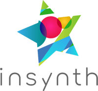
As a symbol, our logo is adopted from the Ursa Minor star constellation. The star family in which the North Star belongs – the universal sign for navigation, hope and stability.
We took this concept and gave it a graphic treatment simplifying it into a single star, then putting three of the major stars from the constellation within the logo itself as three circles.
Unlike technological devices, the stars will never become obsolete as they will remain a symbol of guidance for years to come as we explore the Milky Way… Let’s face it, we’re all nerds!
Our logo conveys a warm, charismatic, and innovative brand focused on growth. The growth and progression aspect is also the key reason why the logo is titled - it represents our dynamic nature and creative perspective.
So, What Does This Mean For You?
In simple, we aim to provide exceptional customer service and that won’t change, our rebrand represents an alignment and a dedication to you and your challenges.
As a matter of fact, you can look forward to a range of new resources to sink your teeth into which will help you get ahead and stay ahead.
If you’d like any support on how a brand repositioning could help you, don’t hesitate to talk to an expert today.
About Insynth
Insynth Marketing is a leading UK construction marketing agency based in Shifnal in the West Midlands.
They use the latest inbound marketing techniques such as construction inbound marketing, to support building product companies to grow their business by proactively driving sales lead generation activity.
As the only HubSpot certified agency to major on construction marketing, we bring together construction marketing strategy, digital strategy, website design, SEO, content marketing, email marketing, sales automation, marketing automation and HubSpot CRM implementation to produce successful campaigns and great results for our clients.
Book Your Free Consultation Today


.png?width=100&name=platinum-badge-color%20(2).png)
