
A unique and compelling website isn’t an option anymore. If a building products business has a poorly designed website, it can result in losing customers and potential leads turning to competitors.
Regrettably, this happens frequently as many small building product businesses create their websites to cut costs rather than working as a lead magnet.
In this blog post, we'll explore the top six website design mistakes to avoid so you can ensure users have positive experiences on your website…
#1: Poor Navigation With Your Construction Website
Navigation is the backbone of a website. We live in an age where everything is delivered to us in an instant, and anything longer will cause people to abandon your site.
A website with poor navigation can be frustrating for architects and specifiers and can lead to high bounce rates. Users should be able to easily find what they're looking for on your website.
Make sure your website navigation is clear, concise, and easy to use. It should be easily accessible from every page of your website, and users should be able to quickly find what they're looking for.
Start by clearly mapping out a navigation bar with pages so users can clearly find what they’re looking for. A search bar also is a great feature for ease of use.

#2: Website Slow Load Times
In today's fast-paced world, users expect websites to load quickly. Slow load times can also result in high bounce rates and lost conversions.
Even the slightest delays matter, so it’s essential to optimise your building products site performance as much as possible. Website speed not only influences user retention and conversion but also impacts the visibility of your site in search engine results.
Both desktop and mobile site speed are now ranking factors for Google, and if you don't maintain satisfactory website performance, your site's presence on search engine results pages (SERPs) may drop, resulting in lower traffic levels.
With the success of your building products website at stake, it's essential not to overlook speed. You can start by assessing current standing through load time tests, identifying areas for improvement, and working on decreasing the loading time.
#3: Lack of Mobile Optimisation
With over half of the internet traffic coming from mobile devices, it's essential to ensure that your building products website is optimised for mobile users.
A website that is not optimised for mobile devices will result in a poor user experience and lost opportunities for engagement and conversions.
It's important to distinguish between a mobile-friendly site and a mobile-optimised site.
A mobile-friendly website can be viewed accurately on smaller screens, although it may appear as a smaller version and might not work perfectly on touchscreen tablets.
While a mobile-friendly site is designed to ensure that your site works on mobile devices, a mobile-optimised site takes it a step further.
A mobile-optimised site not only adjusts its display to properly fit on smaller screens, but also makes the site much easier to navigate by reformatting content and displaying larger navigation buttons, and optimising images based on screen size.
Make sure your website is responsive and adjusts to different screen sizes.

#4: Poor Use of Colour On Your Building Products Website
Colour plays a crucial role in improving memory retention and recall, especially in the case of products and brands. This is why businesses and organisations place a great deal of emphasis on creating a distinctive and memorable brand through the use of colour.
By using colour to evoke certain emotions from your target audience, you will stand out from competitors. In a crowded market, your building products website's colour scheme and typography are critical components of its design and can make all the difference in defining its identity.
To ensure that your website's design is not overly complicated and overwhelming for users, it’s important to limit the colour palette to two or three carefully selected colours at the outset of the project.
#5: Not Prioritising Whitespace and Content On Your Site
Your building products website and marketing campaign rely heavily on content. It communicates information about your business and the products or services you offer. It’s important to pay attention to the fonts you choose and the layout of your content on the page.
The typeface you use not only conveys the actual words you write, but also represents your brand image, so it's important to choose a legible and attractive font.
To direct site visitors' attention around your site, use white space effectively and make large blocks of text less daunting. Many people make the mistake of including too much text on their websites, so try breaking it up where possible and using visual elements to represent concepts.
You should also keep your content up-to-date, otherwise, your target audience may think you have gone out of business.
#6: Lack of Call-to-Actions Throughout Your Construction Site
The CTA, or call to action, is a crucial entry point to your business. It serves as a directive to visitors, compelling them to take action by clicking, downloading an eBook, or learning more about your product.
Your CTA must be clear in its instruction, providing sufficient information for specifiers or architects to understand what they stand to gain from following through and what details they must provide.
However, there’s a fine line between being helpful and becoming a nuisance. To ensure a positive user experience, it’s imperative that your CTA is concise and straightforward in its message. Limit the amount of form-filling required and allow your audience a few minutes to explore your page before the CTA becomes visible.
#7: Not Understanding Your Building Product Target Audience
Recognising the importance of understanding your target audience is essential for building product business owners. Especially if you’ve invested considerable time in creating customer profiles and developing strategies to target buyer personas.
The same level of significance applies to web design, as the appearance and feel of your website will naturally appeal to a particular type of visitor.
Websites can have a professional, fun and cheerful atmosphere. However, trying to cater to multiple audiences can result in a website that lacks coherence.
Therefore, creating a different website experience where architects, specifiers and contractors select what they’re looking for with clear navigation can work well.
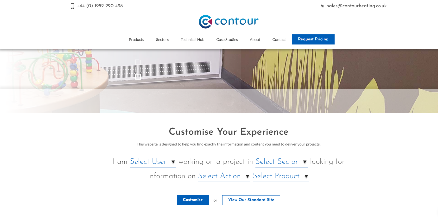
Here you can see Contour Heating have adopted this well. Users can customise their experience based on their sector, action and product. And if they prefer, they can also just visit a standard website too.
#8: Lack Of Contact Info On Your Construction Website
It’s also common to see websites have a lack of contact information or for this information to be hard to find. This is crucial because this could be the moment an architect or a specifier wants to purchase a service or a product.
It's important to provide them with the required contact information as soon as they decide to choose your building products business.
If a visitor has to navigate through your website to find your contact details, it could lead to frustration and ultimately cause them to leave.
Your website should have a readily accessible "Contact Us" page, or your contact information should be available at the bottom of each page.
Conclusion
Website design plays a critical role in creating a successful online presence.
By avoiding these eight website design mistakes, you can create a website that is user-friendly, visually appealing and optimised for conversions.
Creating a website that provides a positive experience to architects and specifiers so your building products business can generate more leads.